The Carousel is originally forked from Agnosia Bootstrap Carousel by AuSoft with many improvements.
For now it works only for Twitter Bootstrap CSS, if you use the ItalyStrap Theme Framework you have already the carousel style and script included, if you use a different theme make shure you have the bootstrap CSS for carousel.
Maybe in future it will be available other type of carousel/slider.
It work with the ID of the attachments or the post type ID.
You can use this functionality with a dedicated widget, a shortcode or the php code, let see how it work:
Media Carousel Widget
If you want to use the widget for media carousel go to ItalyStrap > Settings > Widget and activate the Carousel Widget
Now go to the Appearance > Widget drang and drop the ItalyStrap Media Carousel widget and put it in the sidebar where you want to display the carousel.
As you can see in the below image you have a lot of options, this options allow you to style carousel as you want (for a list of all options see below):


Media Carousel Shortcode
Use the built-in [gallery] shortcode with the attribute type="carousel", this will show Bootstrap Carousel based on the selected images and their titles and descriptions, otherwise It will show standard WordPress Gallery.
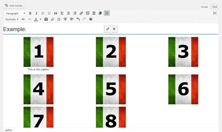
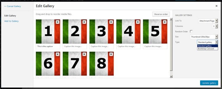
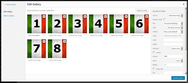
For more informations about WordPress Gallery see these links: http://codex.WordPress.org/The_WordPress_Gallery http://codex.WordPress.org/Gallery_Shortcode
Usage example:
The Carousel also adds Schema.org markup for ImageObject and exifData.
If you want show different image size in different device (tablet or phone) you can add sizetablet and/or sizephone attribute to shortcode, see below for more informations.
[gallery type="carousel" ids="42,43,44,45,46,47,48,49"]
You can add a type parameter directly from the Insert Media screen on the gallery tab.
You can also select an image size only for standard carousel, for responsive size add it directly in the code, see below or see screenshot n°5 in plugin screenshot page.
Optional attributes:
name: any name. String will be sanitize to be used as an HTML ID. Recommended when you want to have more than one carousel in the same page.
Default: italystrap-bootstrap-carousel.
Example:[gallery type="carousel" ids="42,43,44,45,46,47,48,49"
name="myCarousel"]indicators: indicators position. Accepted values: before-inner, after-inner, after-control, false (hides indicators).
Default: before-inner.
Example:[gallery type="carousel" ids="42,43,44,45,46,47,48,49" indicators="after-inner"]
width: carousel container width, inpxor%.
Default: not set.
Example:[gallery type="carousel" ids="42,43,44,45,46,47,48,49" width="800px"]
height: carousel item height, inpxor%.
Default: not set.
Example:[gallery type="carousel" ids="42,43,44,45,46,47,48,49" height="400px"]
titletag: define HTML tag for image title.
Default: h4.
Example:[gallery type="carousel" ids="42,43,44,45,46,47,48,49" titletag="h2"]
wpautop: auto-format text.
Default: true.
Example:[gallery type="carousel" ids="42,43,44,45,46,47,48,49" wpautop="false"]
title: show or hide image title. Set false to hide.
Default: true.
Example:[gallery type="carousel" ids="42,43,44,45,46,47,48,49" title="false"]
text: show or hide image text. Set false to hide.
Default: true.
Example:[gallery type="carousel" ids="42,43,44,45,46,47,48,49" text="false"]
containerclass: extra class for carousel container.
Default: not set.
Example:[gallery type="carousel" ids="42,43,44,45,46,47,48,49" containerclass="container"]
itemclass: extra class for carousel item.
Default: not set.
Example:[gallery type="carousel" ids="42,43,44,45,46,47,48,49" itemclass="container"]
captionclass: extra class for item caption.
Default: not set.
Example:[gallery type="carousel" ids="42,43,44,45,46,47,48,49" captionclass="container"]
control: control arrows display. Accepted values: true (to show), false (to hide).
Default: true.
Example:[gallery type="carousel" ids="42,43,44,45,46,47,48,49" control="false"]
interval: the amount of time to delay between automatically cycling an item in milliseconds. Example 5000 = 5 seconds. If 0, carousel will not automatically cycle.
Default: 0. (In this link yuou find why is set to 0 by default)
Example:[gallery type="carousel" ids="42,43,44,45,46,47,48,49" interval="2000"]
pause: pauses the cycling of the carousel on mouseenter and resumes the cycling of the carousel on mouseleave.
Default: “hover”.
Example:[gallery type="carousel" ids="42,43,44,45,46,47,48,49" interval="hover"]
size: size for image attachment. Accepted values: thumbnail, medium, large, full.
Default: full or your own custom name added in add_image_size function. See wp_get_attachment_image_src() for further reference.
Example:[gallery type="carousel" ids="42,43,44,45,46,47,48,49" size="full"]
responsive: Activate responsive image. Accepted values: true, false.
Default false. It works only if you addsizetabletandsizephoneattribute. See below.
Example:[gallery type="carousel" ids="42,43,44,45,46,47,48,49" responsive="true" size="medium"]
sizetablet: Size image for tablet device. Accepted values: thumbnail, medium, large, full or your own custom name added in add_image_size function.
Default: large.
Example:[gallery type="carousel" ids="61,60,59" responsive="true" size="full" sizetablet="large"]
sizephone: Size image for phone device. Accepted values: thumbnail, medium, large, full or your own custom name added in add_image_size function.
Default: medium.
Example:[gallery type="carousel" ids="61,60,59" responsive="true" size="full" sizephone="medium"]
Native supported attributes:
orderby: Alternative order for your images.
Example:[gallery type="carousel" ids="61,60,59" orderby="rand"]
link: where your image titles will link to. Accepted values: file, none and empty. An empty value will link to your attachment’s page.
Example:[gallery type="carousel" ids="61,60,59" link="file"]
Available options
Below there is a list with all available optins for the carousel, some options are hidden on widget or shortcode because for simplify the functionality:
Media or Post Type ID
Attribute:
ids
Default:empty
You can insert the ID of the media images or the ID of every post type (post, page, attachment, custom post type and so on) all separated by comma. Example:1,2,3,4Type of gallery
Attribute:
type
Default:carousel
Enter the type of gallery, if it's not "carousel", nothing will be done.Order Image By
Attribute:
orderby
Default:menu_order
Alternative order for your images.Carousel Name
Attribute:
name
Default:italystrap-media-carousel-1796832236
String will be sanitize to be used as an HTML ID. Recommended when you want to have more than one carousel in the same page.Carousel container width
Attribute:
width
Default:empty
Carousel container width, in px or % (optional). Default: empty. Example: 500px or 100%Carousel container height
Attribute:
height
Default:empty
Carousel item height, in px(optional). Default: empty. Example: 500pxIndicators
Attribute:
indicators
Default:before-inner
Indicators position. Accepted values: before-inner, after-inner, after-control, false (hides indicators).Enable control
Attribute:
control
Default:1
Enable or disable arrow right and left. Accepted values: true, false. Default: true.Carousel interval
Attribute:
interval
Default:empty
The amount of time to delay between automatically cycling an item in milliseconds. Example 5000 = 5 seconds. Default 0, carousel will not automatically cycle.Pause
Attribute:
pause
Default:hover
Pauses the cycling of the carousel on mouseenter and resumes the cycling of the carousel on mouseleave.Show Title
Attribute:
image_title
Default:1
Show or hide image or post title. This is not the widget title. Set false to hide. Default: true.Carousel titletag
Attribute:
titletag
Default:h4
Define HTML tag for image title. Default: h4.Text
Attribute:
text
Default:1
Show or hide image caption text (the excerpt of attachment) or the excerpt of the post. Set false to hide. Default: true.wpautop
Attribute:
wpautop
Default:1
Auto-format text. Changes double line-breaks in the text into HTML paragraphs<p>...</p>. Default: true.do_shortcode
Attribute:
do_shortcode
Default:empty
Allow shortcode for text. Default: false.Post or Image link
Attribute:
link
Default:none
Where your image titles will link to if "title" is set to true. Accepted values: file, none and empty. An empty value will link to your attachment’s page.Link button
Attribute:
link_button
Default:empty
Show or hide a link to post, this works only for post_type and for parent of images, it works only with the selection of the link above. Default: false.Link button text
Attribute:
link_button_text
Default:Read more
The text to display in the button link. Default: Read More.Link button CSS class
Attribute:
link_button_css_class
Default:btn btn-primary
You can add custom CSS class to the button. Default: btn btn-ptimary.Container Class
Attribute:
containerclass
Default:empty
Extra CSS class for carousel container.Item Class
Attribute:
itemclass
Default:empty
Extra CSS class for carousel item.Caption Class
Attribute:
captionclass
Default:empty
Extra CSS class for carousel caption.Size for images
Attribute:
size
Default:full
Size for image attachment. Accepted values: thumbnail, medium, large, full or own custom name added in add_image_size function. Default: full. See wp_get_attachment_image_src() for further reference.Responsive image
Attribute:
responsive
Default:empty
Activate responsive image. Default false. It works only if you add sizetablet and sizephone attribute. See below.Size for images
Attribute:
sizetablet
Default:large
Size for image attachment for tablet device. Accepted values: thumbnail, medium, large, full or own custom name added in add_image_size function. Default: large.Size for images
Attribute:
sizephone
Default:medium
Size for image attachment for phone device. Accepted values: thumbnail, medium, large, full or own custom name added in add_image_size function. Default: medium.
Options available:
Carousel example:

ItalyStrap WordPress starter theme framework (1)

ItalyStrap WordPress starter theme framework (2)

ItalyStrap WordPress starter theme framework (3)

ItalyStrap WordPress starter theme framework (4)

ItalyStrap WordPress starter theme framework (5)

ItalyStrap WordPress starter theme framework (6)

ItalyStrap WordPress starter theme framework (7)